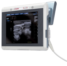
Esaote MyLab One
Designed around the Image
“MyLabOne is not a portable ultrasound system packaged as a portable computer. It has been designed from the ground up to be unique and innovative in many applications” says Fabio Rezzonico.
Client
Esaote
Service
Design, Engineering, Brochure
Year
2009
Medical Design Strategy: less is more
Approach
Designing medical devices is a complex process. It is complex because it has to be easy and ergonomic both for the doctor and for the patient.
For the doctor we need to create a tool with an intuitive interface and specific ergonomics: the interface (keyboard and monitor) has to be designed around the doctor needs and the doctor’s environment. This attention to ergonomics is expressed even in the smallest diagnostic devices such as probes. Every interaction that the doctor has with the equipment is evaluated for comfort, safety, current protocols, and to facilitate the doctor in the aim to treat the patients.
For the patients the approach is different. Technology can give a life changing diagnosis or treatment. In many cases the patient is unfamiliar with the procedure and technology. The design needs to calm and reassure the patients so that they can be at ease, and focus on their healing. Many details can affect the patient’s perception, such as the shape, color, texture and lighting.
Design Strategy
There are two basic parts to medical product design. The first is staying ahead of the competition in the evolution of technology. It is ever-changing materials, applications, and hardware.
We work with companies to harness their technology. Yet, the technology is not an end in itself, but a means to treat and diagnose patients. The aim is to make a seamless integration so that the technology disappears. The result is a product that works in harmony with the doctors. This ultimately improves both the user’s experience and the competitive advantage of the product. The second part to the design strategy is innovation. Why create a new product if it is not to make something innovative? In every project we try to introduce something new; better ergonomics, more functions, increased comfort, etc. This is often the most creative and rewarding part of the design, yet this is never done arbitrarily. We first ask questions, “How can we better meet the user’s needs?” and “How can we make this process better?” Then we come up with solutions to balance technology and aesthetics.
Design Fulfillment
The key to solving these problems is to find the perfect point of balance where the technology and innovation are transformed into a simple and clean design. When this balance is achieved the end result should facilitate diagnosis, treatment, and care for patients with ease and comfort. And, of course, be a brilliant design.
Complexity Simplified: a simple shape to meet all uses
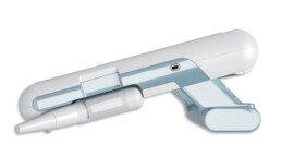
Handle.
The handle contributes to the flexibility of the unit: it works to carry the system, to set on a table in a correct ergonomic position, to hold the system in the arms and it works also as battery housing
Innovative interface.
The touch interface gives maximum flexibility for different applications thank to a dedicated software with exclusive tools
Supports.
The scanner can be attached to a articulated arm or put on an ergonomic trolley

